When I visited Turkey for the first time, I was amazed. Everything was so different and I wanted to understand all about it. I did my best to learn the language and started exploring the country hitchhiking and camping. Doing so, I was able to meet lots of people in different places, see how they live and share their thoughts.
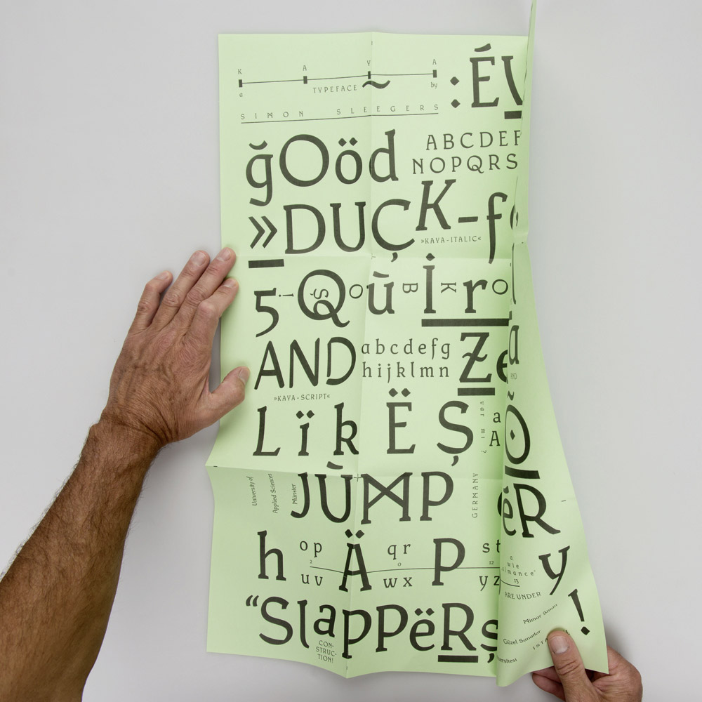
During one of those trips, I tried to express my experiences by sketching a typeface. Traditional and contemporary aspects, functionality and hospitality shaped a mix of feather stroke and slab serif. KAYA – a humanist font with technical elements, which I realized in the following term at the Mimar Sinan University in Istanbul.

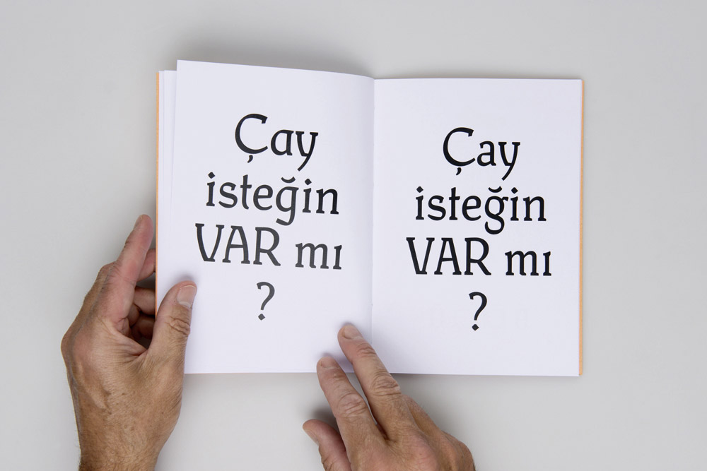
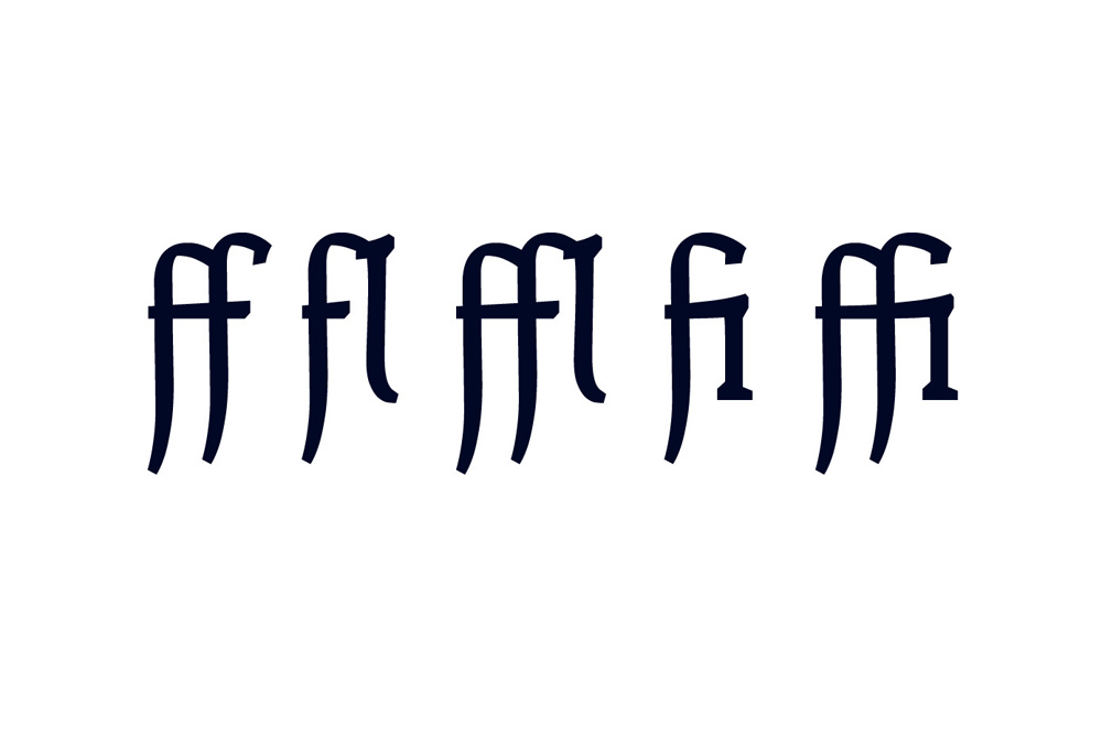
KAYA is able to speak lots of languages, contains ligatures and alternative glyphs, which can be activated through a stylistic set.
STAND DER SCHRIFT
Feel free to use the font for non-commercial stuff. I would be happy to see some pictures of the font in use.
KAYA-Medium by Simon Sleegers is licensed under a Creative Commons Attribution 3.0 International License.


